
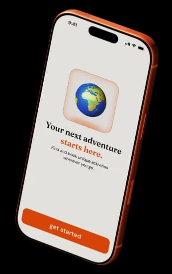
Romly
Solo mobile app concept · 2026
Project at a glance
- Challenge
- Travellers compare blogs, maps, social posts, reviews, and booking platforms before choosing an activity.
- Design response
- Create a preference-led flow that keeps discovery, comparison, saving, booking, and tickets in one place.
- Current state
- An end-to-end mobile concept ready for prototype testing across discovery and checkout.
Project details
- Platform
- Mobile app
- My role
- UX research
UX/UI design
Visual design - Team
- Solo project
- Timeline
- Self-directed concept study · 2026
- Category
- Travel / experiences / booking

The central design question was how to preserve the feeling of discovery while making comparison and booking easier to manage.
Why planning feels fragmented
An activity can appear inspiring in one place but require another service for prices, availability, location, reviews, and booking details.
The design opportunity was to connect those decisions in one flow without turning spontaneous exploration into a rigid search form.
The need
Travellers want to find activities quickly without jumping between different apps, blogs, and maps.
The opportunity
Create one simple mobile experience where users can discover, save, and book activities based on their personal travel style.
Problem statement
Travellers often know where they want to go, but they struggle to find activities that match their interests, time, budget, and travel style in one simple place.
Problem
Activity planning is often fragmented. Users jump between blogs, maps, social media, and booking platforms, which makes discovery slow, confusing, and hard to compare.
Challenge
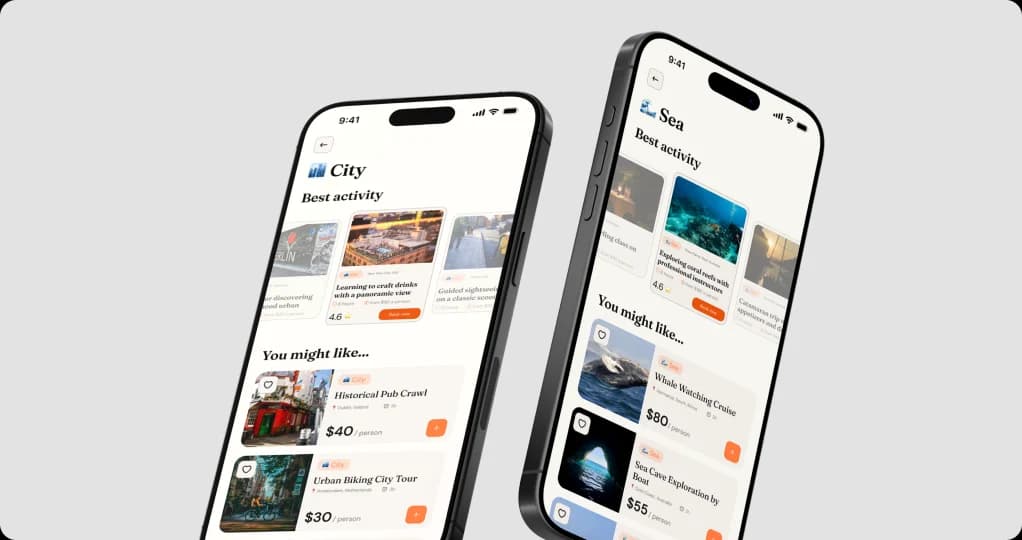
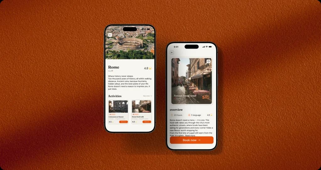
The challenge was to design an experience that feels inspiring and visual, while still giving users enough clear information to trust and book an activity.
Solution
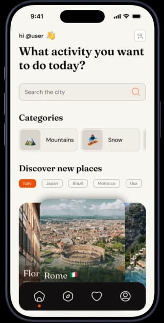
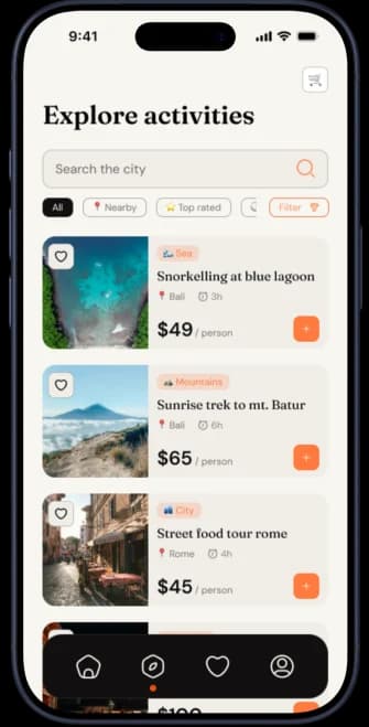
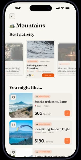
Romly brings discovery, personalisation, and booking into one mobile flow, helping users choose preferences, explore activities, save favourites, and book with confidence.
Research
I looked at travel search behaviour, booking platforms, and user discussions around trip planning to understand how people search for activities and where the experience becomes confusing.
The research showed that users are not only searching for places to visit, but for activities that feel relevant, trustworthy, easy to compare, and simple to book.
People search with local intent
Common travel searches are based on location, such as “things to do near me”, “things to do in [city]”, or “best activities in [destination]”. This shows that users often need fast, location-based discovery when they are already planning or already travelling.
Planning is fragmented
Users often move between blogs, maps, social media, booking websites, and reviews before choosing an activity. This creates too many tabs, too many options, and makes it harder to compare price, location, duration, and quality in one place.
Trust decides the booking
Before booking, users need strong visual proof, clear prices, ratings, reviews, location, duration, cancellation details, and secure payment. Research shows that photos, reviews, and trustworthy information strongly affect travel decisions.
User flow
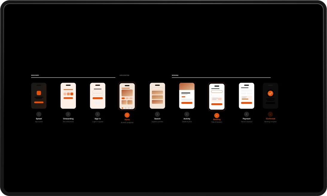
The user flow maps the main journey from first opening the app to discovering, selecting, and booking an activity.
The flow is built to reduce friction: users choose their preferences first, explore relevant activities, review details, and complete the booking in a clear step-by-step process.
Swipe to explore the complete flow
Interactions
The key interactions focus on helping users personalise their experience and keep useful activities saved during the planning process.
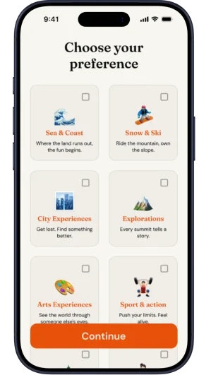
Preference selection
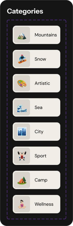
Users select the types of activities they are interested in, allowing the app to create a more relevant discovery experience.
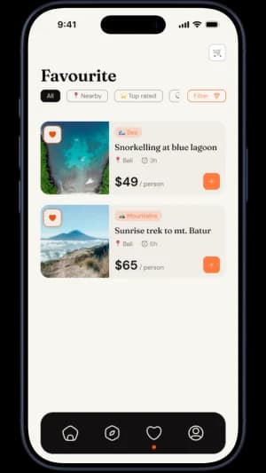
Saved activities
The favourites page gives users a simple way to collect, compare, and return to activities before deciding what to book.
Visual design
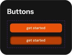
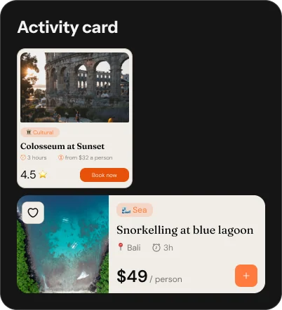
The visual direction was built to feel warm, simple, and travel-focused, using clear cards, rounded shapes, strong imagery, and an orange accent to guide important actions.
Colour & mood
A warm dark background with orange highlights creates energy and connects the interface to travel, movement, and discovery.

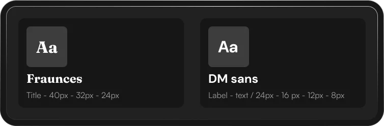
Typography
The typography pairs an expressive serif with a clean sans-serif to balance personality and readability across the app.
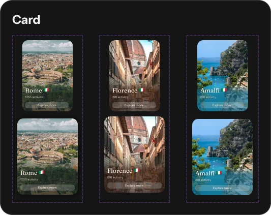
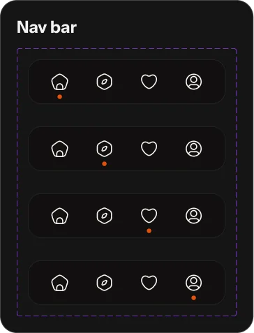
UI elements
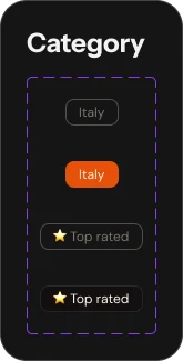
Buttons, cards, category chips, search bars, and navigation components were designed to be simple, rounded, and easy to scan on mobile.
Final design
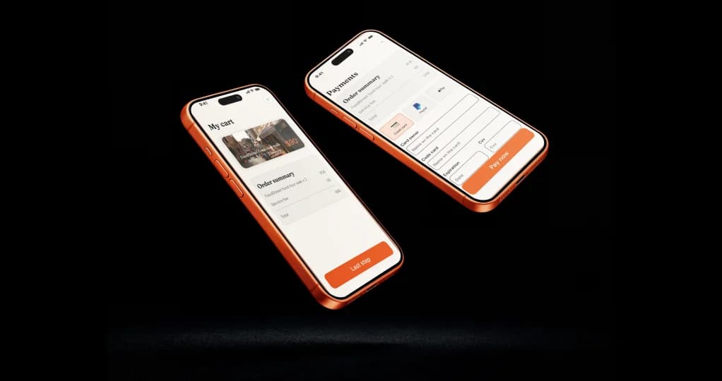
The final app combines onboarding, personalised discovery, search, favourites, profiles, and booking into one complete mobile experience.
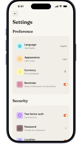
Settings
The settings screen gives users control over preferences, notifications, support, language, and account information.
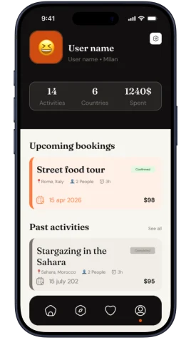
Profile
The profile page helps users manage upcoming bookings, past activities, travel stats, and personal account details.
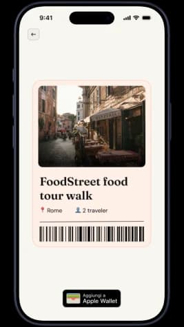
Ticket
The ticket screen confirms the booked activity and gives users the key information they need before the experience starts.
From inspiration to booking, Romly turns travel planning into a clearer, more personal experience.
This project explored how a travel app can guide users from curiosity to action. By combining personalisation, visual discovery, saved activities, clear details, and post-booking support, the final experience helps users feel more confident when choosing what to do during a trip.
Key takeaways
Personalisation creates direction
Starting with user preferences makes the experience feel more relevant and helps reduce the effort of choosing activities.
Clear information builds trust
Price, rating, duration, location, and booking details help users compare options and feel confident before booking.
A product should continue after the booking
Profiles, settings, saved activities, and tickets make the app feel complete beyond the moment of payment.
Continue exploring
Next case study
Mobile surf companion · Product design
SurfWise
A clearer way for surfers to understand complex conditions, choose the right spot, and return at the right time.
Looking for a product designer?
I’m interested in thoughtful product teams, UX/UI roles, and collaborations where clear thinking and strong visual craft matter.